
Treiner is Australia and New Zealand’s premier football coaching marketplace service. Headquartered in Melbourne, Victoria, their platform provides players of all skill levels the opportunity to increase their abilities, learn new skills and become better players both on and off the field by connecting them to quality coaches.
As the platform is growing, Treiner was looking for an updated look and feel that was in-line with where they are headed as a company. Previously, their logo and brand design were not on-par with their mission and vision. Hence, the goal of the project was a complete rebrand that reinforces the premier and high-quality service they provide, while also appealing more to their target market and making it easier for their audience to identify with the brand as Treiner increases their marketing efforts.
Looking at their previous logo, it was also identified that they were facing issues with functionality. Due to the detailed nature of the logo, it was not working well at smaller sizes without losing its detail. A good logo is always scalable and responsive – fitting right into the spaces it needs to and staying legible. Another aspect that was set out to be improved was making a less generic and more unique and memorable mark without losing its association with football.
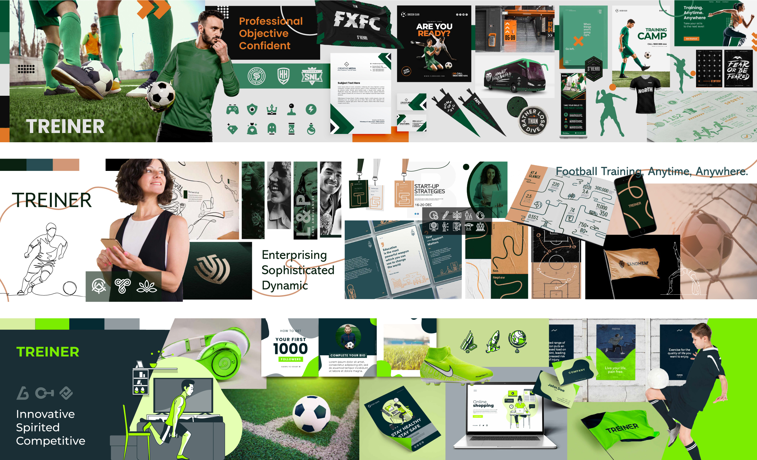
After an initial discovery session wherein target customer profiles and brand attributes were identified, 3 Stylescapes were presented, one focusing on each customer profile. Stylescapes are images sourced from the web and collated together to create a visual direction. They allow the client and I to get on the same page right from the start of the project removing uncertainty and issues later on. It also gives something to fall back on to determine whether a design is appropriate or not. The team at Treiner chose to move forward with the first Stylescape, and it directed the design decisions moving forward.
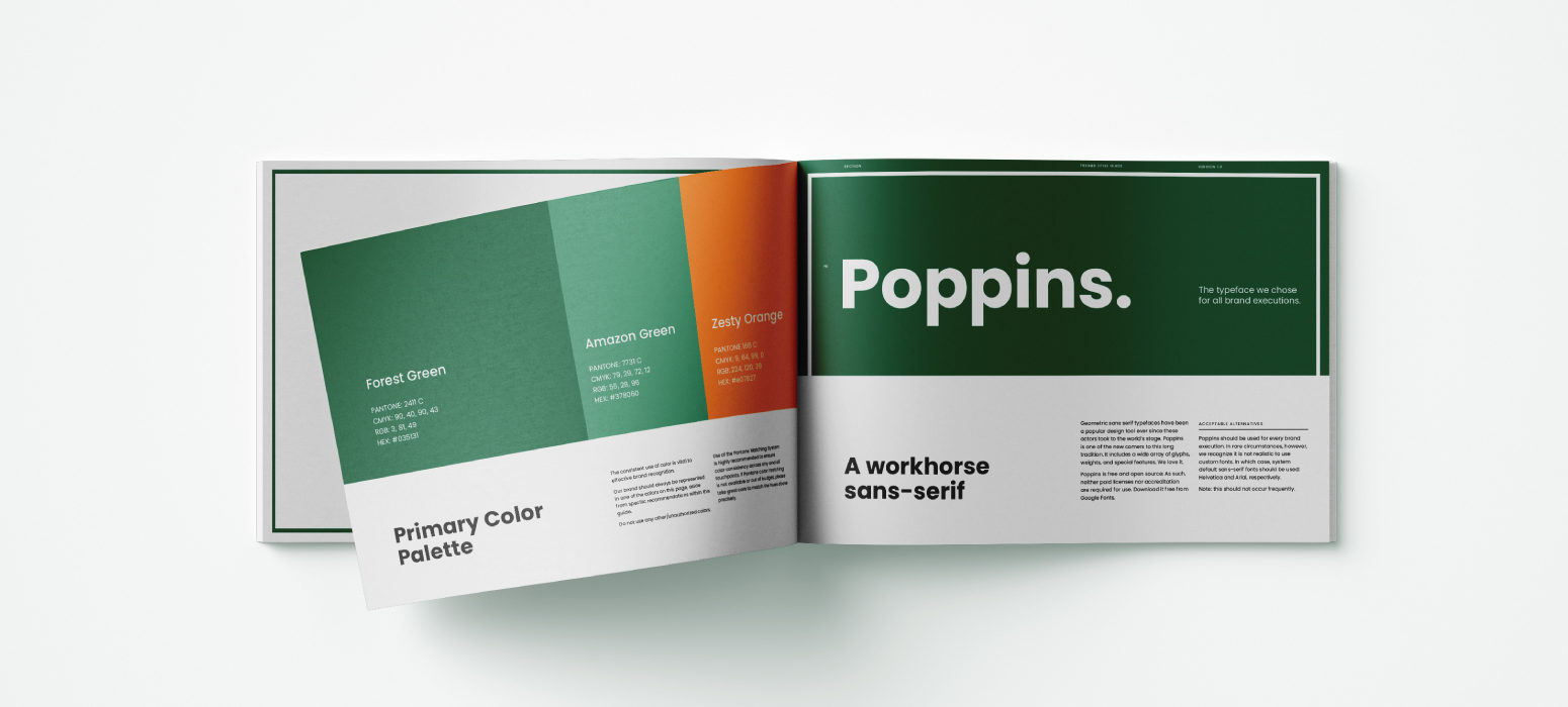
The choice of color and typography play a crucial role in achieving the desired feel and style for a brand. For Treiner, I stuck to a green as the primary color for continuity from the older logo and the fact that the color symbolizes professionalism, safety, and growth or progress which is fitting for a football training platform focusing on improving younger players; making it more appealing to two of Treiner’s target customers – soccer moms and football coaches. The orange was added onto the primary palette as it appeals to young people due to its associations with excitement, fun, and motivation. It also works well with green and is an attention-grabbing color that would help with marketing and promotional designs.
The typeface used, Poppins is a great geometric sans-serif that suits the geometric and clean style of the brand. It is also very versatile and easily legible on digital applications like websites and mobile apps – which is an important consideration for Treiner given that they are primarily an online marketplace/platform.
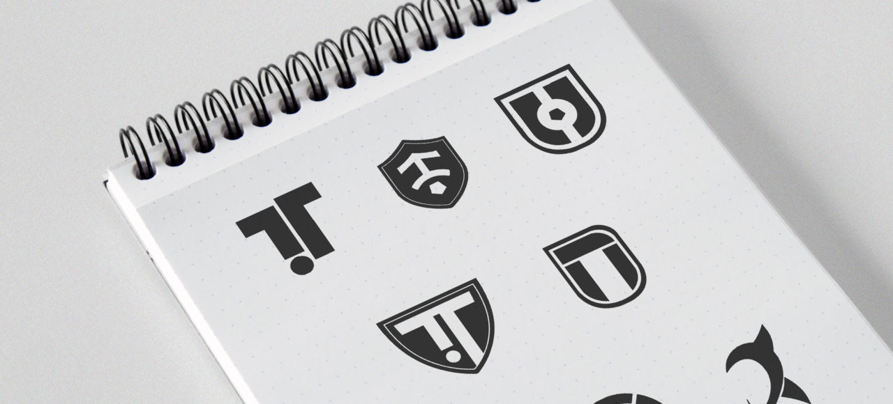
Next up was the logo. The strategy behind the logo concepts was as follows:
After explorations and multiple sketches, the best 4 logos were presented. From which – the logo below was the solution the client chose. The use of a shield serves two purposes – it helps bring out the desired amount of traditional feel and also acts as a subtle connecting link between the brand’s old and new logo. The use of the circle, the thinner stroke along the border, the bold text, and the color green also relate back to the older version of the logo. All of this allows the customers to see a connection and an evolution from the older version rather than coming out with something completely new and unrelatable.

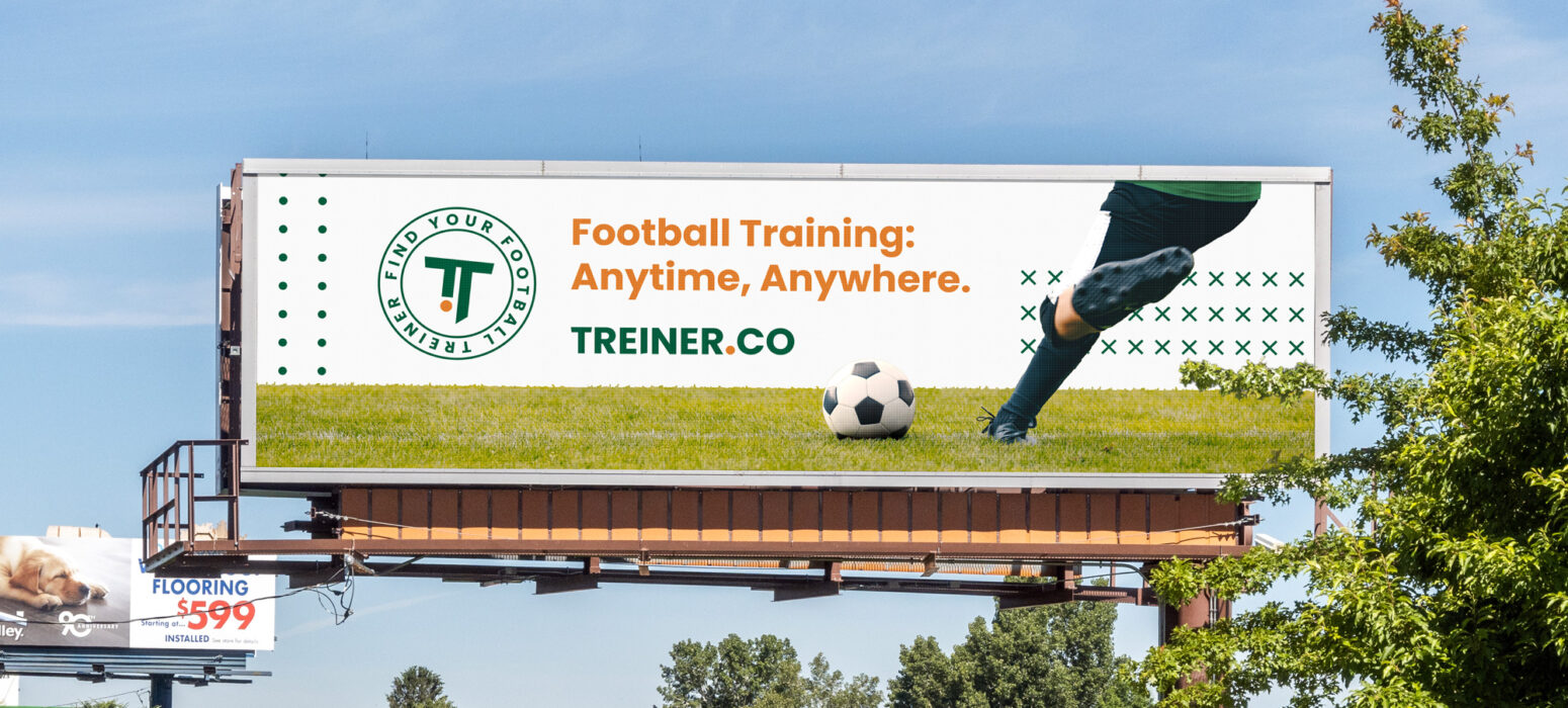
Trying to fit the same mark simultaneously on a billboard and on a mobile application is a challenge. The identity system has been designed for flexibility, consistency, and brand recognition – with different logo lockups that would cover every space imaginable.

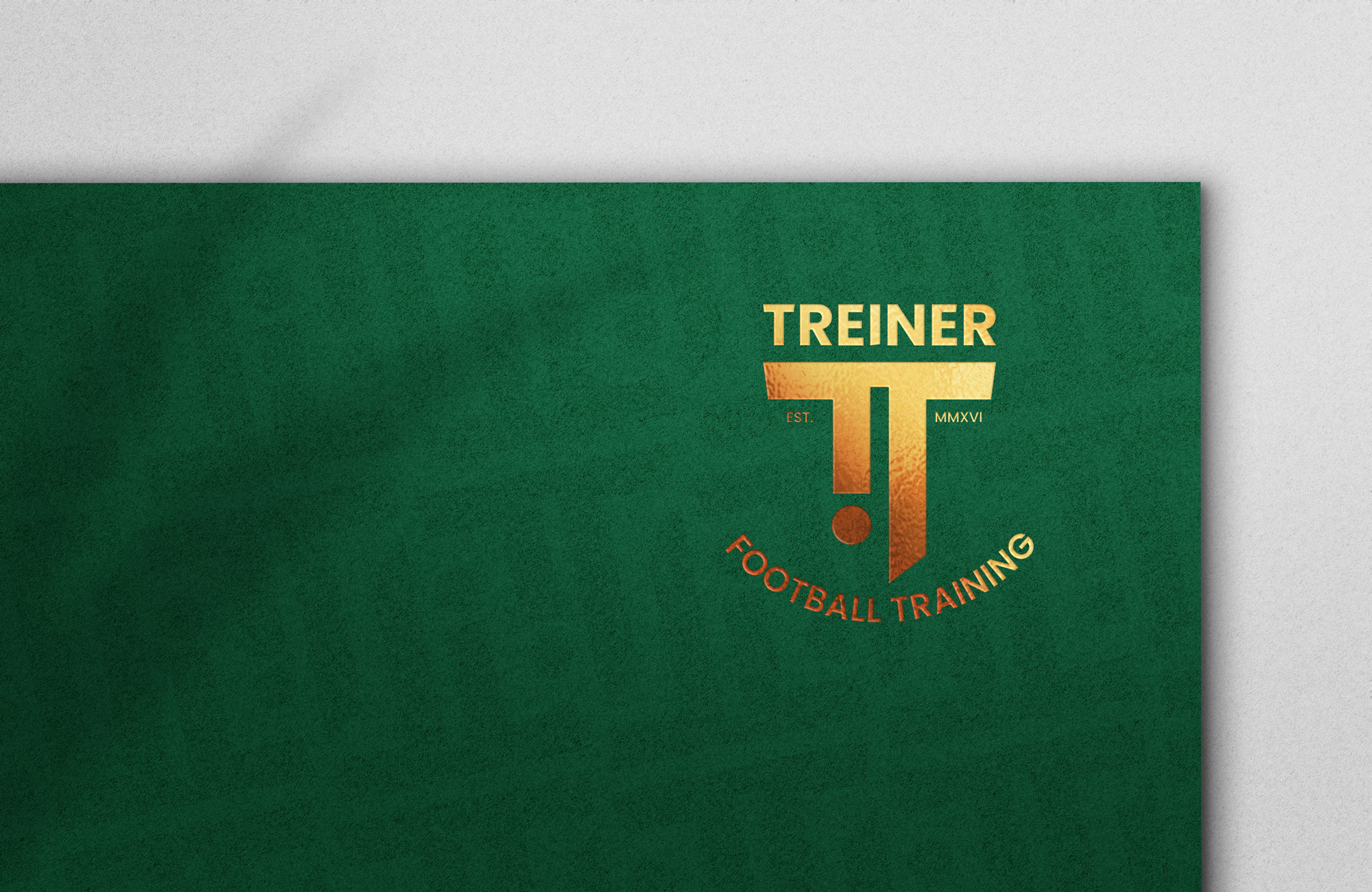
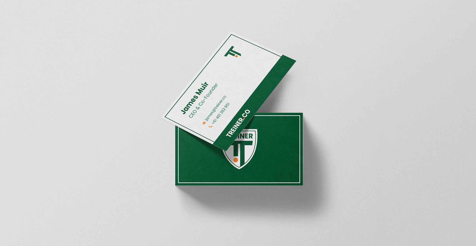
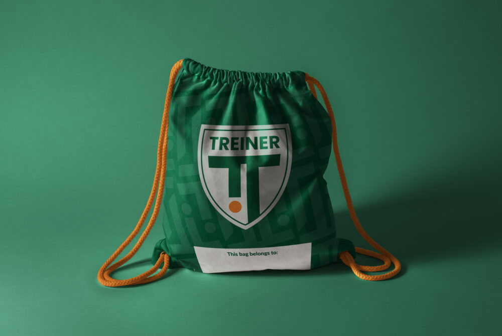
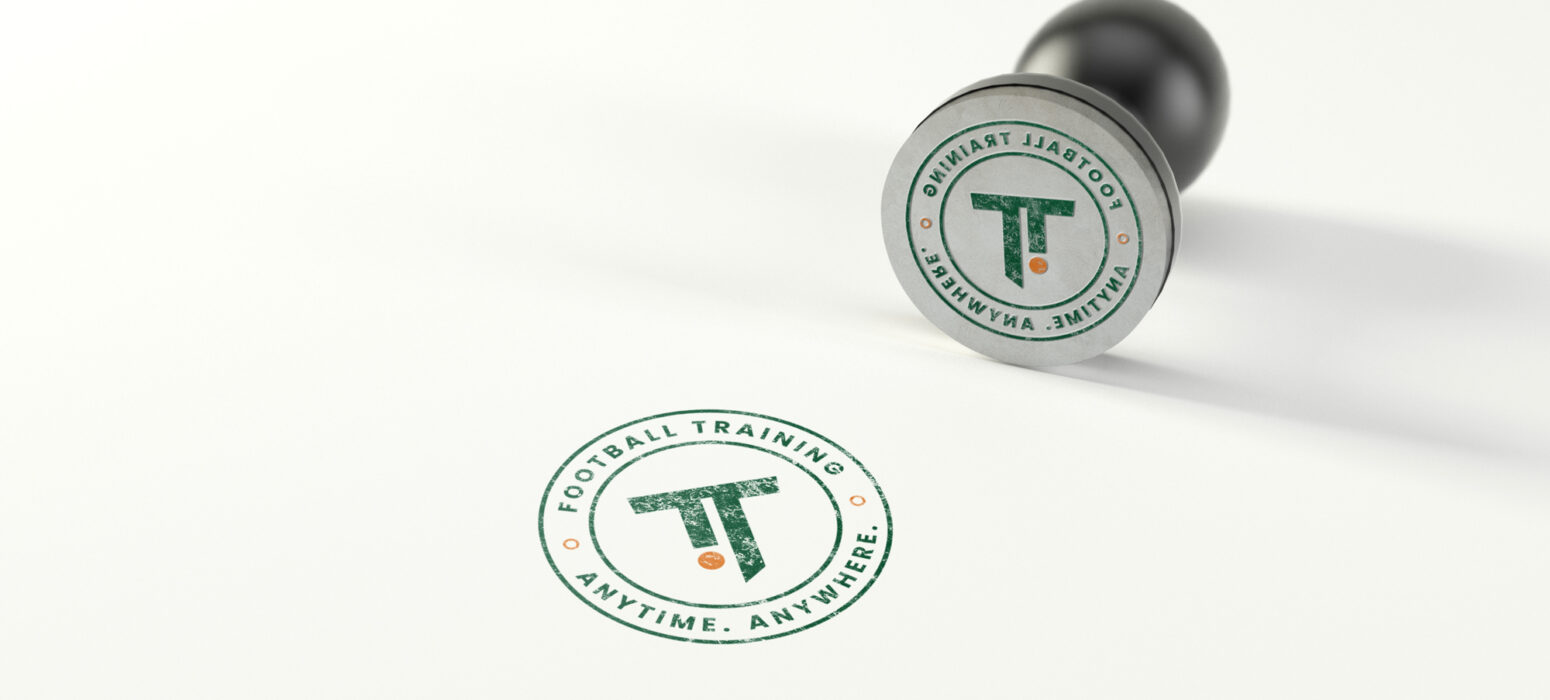
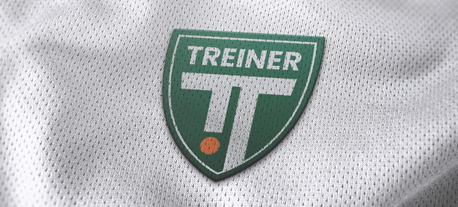

All the important aspects of the brand and design were provided in a detailed style guide of over 50 pages. Treiner now has a document that they can easily share with others – whether that be coaches within their marketplace, the football academies they partner with or external design teams. The document highlights the mission and values of the company along with design standards and rules to be followed whenever current brand assets are being used or new assets are being created. This ensures visual consistency which is very important to help build brand recognition and loyalty.
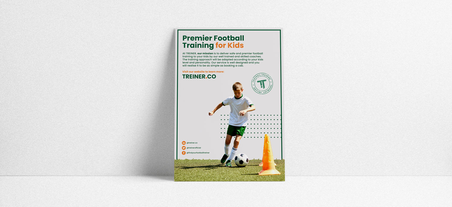
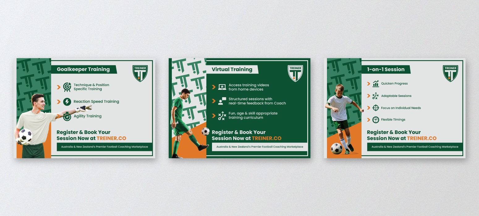
“I approached The Running Spark as I knew they had previous experience when it came to graphic designing for businesses in the sports industry, and they would be able to understand what we wanted quite quickly. They worked on a full rebrand for our football coaching platform. As the platform is growing, we were looking for a fresh look and feel that is in-line with where we are headed as a company. Their work exceeded our expectations, and I would definitely recommend them.”